Dylan Gibson illustrationAbout Dylan Gibson IllustrationPortfoliodownload wallpaperscontact Dylan

Wednesday, 27 June 2012

I Love Comics


I collected comic books a lot when I was a kid, still do in graphic novel form.  I was my introduction and I’m sure most people's to the world of illustration the artists of these books would use their skills to tell the stories the comic book writers wanted to tell, talented artists would take the words and concepts and flesh out the story telling the narrative in brightly coloured frames and create fun and interesting characters to inhabit worlds of their creation.  I bought or borrowed many from the Commando war comics, 2000AD and Judge Dredd, Spiderman, X-men and The Transformers, my earliest recollection of browsing and choosing my own comic was getting Transformers issue 22 in 1985 from a little newsagent close to where we lived in Northampton. Comic books are not solely produced for kids, they just happen to buy them with their pocket money.  

Transformers issue 22 (it was only 27 pence!)  Though it was nearly a third of my weekly pocket  money.

The themes explored by the writers and artists are weighty and relevant to not just life growing up and trying fit in but issues of alienation, being different and acceptance of otherness, stories about overcoming difficulties in the face of adversity and dealing with loss or abuse all infiltrate and help inform an impressionable mind.  They can be very literate too, I was introduced to classic literature by the stories they told inspired by Greek myths, Shakespeare and other older mythologies including the bible and the epic of Gilgamesh, all laid out in the pages of Superhero comics.

Comics are also heavy influenced by the times they were written and illustrated by, the creative’s involved in their construction would enrich their narratives with moral messages with world events and politics in a way that would assist in the storytelling.  By putting themselves the comic characters shoes they could tell stories inspired by real world events things complicated or horrid could be made sense of in the small dramatic frames.  The horror of World wars, The Korean War, Vietnam and the Watergate scandal, Capitalism and Communism all filtered through and grounded the story to create a more textured environment for the Superhero’s, giant robots or aliens to inhabit.

Judge Dredd created by writer John Wagner and artist Carlos Ezquerra was another favourite of mine, Dredd inhabited the authoritarian police state of MegaCity 1, as one of the judges of that city he was had the powers of the police, jury and executioner.  It was violent and heavily laced with issues of Democracy, corruption, and tyranny as Dredd himself was an instrument of a dictatorial regime that enforced a cruel form of justice on the criminal ilk and on democracy activists alike.

Judge Joesph Dredd.


Today my bookshelves have graphic novels from Alan Moore, His excellent Watchmen (please read the book and don’t judge it by the film) V for Vendetta (again don’t judge by the film) From Hell, Frank Miller’s Batman The Dark Knight Returns and Sin City and other works from Neil Gaiman, Garth Ennis and Mike Mignola.  

Its seems that most have been made into films, with varying degrees of success and its very understandable why the stories are being retold on the big screen.  They have to do with the big themes, tragedies and larger than life characters and environments peppered with real world concerns and issues of being human and all that means that have been so lavishly created.  These modern day myths and struggles are continuing the traditions of storytelling that have been with us since people learned to communicate with one another, to write and tell stories to spin tales of powerful Gods and mythical creatures and the consequences that their actions had on humankind while also speaking of personal dramas. 

Like all good stories and Science Fiction is also a very good example of this: Create a world and people live in it, far into the future or on another world, fill it with vengeful Gods, monsters, mythical creatures, superheroes or mechanical beings. Make it different enough from our world while still making the characters believable and you can write moral tales about genocides, teen pregnancies, ideologies, bigotry, sexism, sexuality and get these issues across to an audience and either inform or change perceptions. 

A few recommendations rightly deserved to be called classics.  Though part of the fun is the discovery of having a look and finding your own favorites.

Watchmen by Alan Moore and Dave Gibbons (1987)

V for Vendetta by Alan Moore and David Lloyd

Batman: The Dark Knight Returns by Frank Miller and Klaus Janson

Hellboy: The Seeds of Destruction by Mike Mignola and John Byrne


Follow me on Facebook
Or visit my illustration portfolio here


Wednesday, 6 June 2012

Tally Ho!


This is a recently finished illustration and will soon be posted on my website folio pages.  Adding new images and keeping the content of my site fresh and up to date is important to keep people coming back while also broadening the subject matter on display.  It can take time to come up with something new if I’m lucky I can maybe add two illustrations a week.  Sometimes these are paid commissions others are selected from self-initiated work. 
My sketch in pencil roughly works out the perspective and dive angle I want to show .


The Spitfire artwork is something I wanted to add to my folder, it’s the sort of thing I hope appeals to potential clients that are in children’s publishing in the UK, the type of illustration they might use for a reference book or children’s encyclopedia if my style is appropriate for the project.   The image itself was sketched out first in pencil then refined and finished off as a pen and ink illustration.  The colour was added after it was scanned on the computer with Photoshop.

Also personally the Spitfire is a very impressive plane, I was lucky enough as a child to get inside the cockpit of one on display and I had a little airfix model I built too.  So it was very nice to revisit those memories and have fun drawing it.

Finished image in pen and ink coloured on Photoshop.  Note the angle of the plane in relation to the horizontal line shown by the White Cliffs of Dover in the background.
Please visit my sight to see more here or follow me on Facebook
Many thanks for dropping by.

Friday, 25 May 2012

Just for fun!


Another self initiated illustration, my take on a poster for the film Drive.  Rendered in pen and ink this illustration was just for a bit of fun and a little diversion from my usual projects I hope you likely.
The rough-work below shows the development of the image, I've taken three images to show though their was lots of other bits an pieces to work on to flesh the illustration out.  

A series of sketches showing the  poster development.
Finished poster!
Visit my website to see more.
Or follow me on Facebook.

Self Initiated Work


Self initiated projects are an opportunity to draw something I do not normally get commissioned to do.  It’s good to fill gaps in my portfolio and expand the breadth of what you can do as an illustrator.  If its not in the folio a client will not commission you do do something similar, so its important to keep the work fit and healthy by adding new things and trimming the fat.

Their is no reason it has to be a chore it can be fun and you can get to draw things that are interesting.  I love dinosaurs and all things prehistoric from lost lands long ago, I've quite bookshelf on the evolution of life, fossils and lovely glossy picture reference books on the subjects too.  It is a wealth of material for the mind to imagine upon, so I decided to get prehistoric.

The below images show the Tyrannosaurus and horned Triceratops placed in a dummy layout to give them a bit of context. Both pen and ink illustrations are the kind of illustration that I hope is attractive to children’s book publishers.
The line art illustration is created from pencil sketches and then coloured on the computer.  For the Triceratops illustration I worked from the fossil remains shown in books only as a challenge and then put flesh on the bones and skin and patters from reference images of animals that exist today.

The mighty Tyrannosaurus, for this I placed my illustration in  a dummy  page layout  to  give it a little context.
The horned Triceratops in dummy layout.
You can see these images and other commissioned work by visiting my website 
Follow me on Facebook

Thursday, 17 May 2012

Recent projects


I’ve been fortunate to work with a great deal of talented people, producing images for advertising Children’s book illustrations, Educational illustrations, Comic book artwork, Storyboard and conceptual art for television, web, client pitch images and even illustrated maps! 

Thorpe Park 2009-Present  Large artwork for the amusement park’s on site map both display and carry fold out version.  The challenge was the fit in all the rides and buildings in a way that you could see the dramatic scale of the main rides and still be used as a functioning map.  The park is always being updated with new rides so the illustration needs to keep up with the new developments. Client LMC Design, London
From project brief to final artwork, I hope to impress and do my best, communicating my ideas discussing with you the most interesting way to turn your brief to an exciting visual. Collaboratively we can develop sketches and I will send those concepts on for your input, to help push the image forward to the final artwork.
My work is all rendered in pen and ink, my line art illustrations have evolved and developed as I’ve improved my craft.  When the ink is dry the final artwork is scanned, colored and tweaked, images can be vectored or saved to the file format you need.
It’s fantastic to see my work in context and I get a great deal of enjoyment seeing it in print.  For over a year on a weekly basis I contributed illustrations for The Guardian Newspapers Saturday edition.  My work has appeared in the London Underground and on Billboard posters in Italy for Piaggio’s urban scooter campaign , Artwork for Aids awareness literature in New York for HB4 Chelsea and recently an illustrated story, The Girl With Green Eyes for Oxford University Press aimed at an older readership to name but a few examples. 

The Girl With Green Eyes, 2011 For Oxford University Press’s Bookworms series, the above shows two images taken from the main location of the book, seven images in total featured this setting.  The challenge was to show the main characters in the same place but from different angles to keep the visuals interesting.
Recently I was fortunate to work on a project for the Northern Ireland Chamber Of Commerce (NICC), producing illustrations for their 230th Anniversary brochure.  The brief required me to research on the developments in science, business and industry in Northern Ireland over the past 230 years to render interesting visuals to sit with and compliment the brochure’s copy.
Northern Ireland Chamber of Commerce Interior artworks (NICC) 2012 A selection of interior artwork for the NICC 230 brochure, expanding on the history and innovation the Chamber has passed through and helped influence.  Interior artwork needed to blend around the copy hence the rough edges and sat on the page couter edges.  Brochure Design by Pink Inc, Belfast.
Double page art for the Northern Ireland Chamber of Commerce (NICC), 2012  Interior cover imaged for the Northern Ireland Chamber of Commerce’s 230 brochure.  The artwork was to show the progression of Belfast from NICC’s foundation 230 years ago to present day.


Please get in touch if you would like to find out more, 


Tuesday, 8 May 2012

Breakdown of an Illustration


I thought I’d write a little about how I would go through the process of illustrating an image in a step by step way including some of the rough work concepts and developmental sketches.

The following artwork is for a self initiated project to draw the cover artwork for Charles Darwin’s The Origin of Species.  First up is my initial idea, rendered in pencil the rough shows the basic composition of the cover, back cover on the left hand side and front on the right.  My idea for the cover was to create a montage of imagery of Darwin and some of the subjects associated with his theory laid down in his book, The HMS Beagle, Finches, Darwin’s study and the Galapagos tortoise.
This concept was sketched down to quickly capture down on paper my montage idea It includes a youthful and older versions of Darwin.

Above I've further developed the image giving it more detail in an effort to see how more finished looking elements work together.  I've added in some stylized waves swirling around the main montage.

 Added clouds in around the edges to fill in the space. These can be knocked back in the final art so not to interfere with the type.


Here colour is added, I wanted to do the final in hues of blue, my choice of blue to use needs further thought.
Here I’ve done a more finished image of the central composition of the illustration.  This is done in pen and ink and I’ve shaded it in a cross hatched way to see how it might look as a variation.  I’ve also added the “Darwin’s Finches” in a way to highlight the changes in their beaks.


The older Darwin here, illustrated in a simpler style without cross hatch shading, as the colour I will add will add the shading I need.  I wanted to develop his likeness more and have singled him out in order to work on his features more.


The finished image, I’ve drawn all the elements separately and added them together in a layered file so I can move them around and change colours more easily.  


Visit my Facebook page for up to date news here http://www.facebook.com Dylan-Gibson-Illustration

Check out my website to see more of my illustrations http://www.dylangibsonillustration.co.uk/


Monday, 12 March 2012

A Matter of Perspective


As an illustrator I find it important to get an impression of depth and movement in my artwork using perspective.  In the context of vision and how we view the world and the objects around us it is the way things appear to the eye based on their positions and sizes. Close things appear bigger in relation to the same object placed further away.  As objects become more distant they appear smaller due to the decrease in the objects visual angle.  A good example of this is a road or parallel rain tracks they appeal to meet at a distant point, referred to as the vanishing point, this point is called the horizon line or geometric horizon at the level of the viewer’s eyes.  While typing this I was suddenly struck by a memory of a sunny afternoon in my school art classroom, where it was first explained to me.  I’m sure most people can remember doodling the horizon lines and box houses vanishing into the distance similar to the example of the vanishing road or track.

Going, going, gone, this image is a classic example of perspective with one vanishing point.

It is understood that the Greeks were not the first to appreciate perspective when scholars wondered for example why a hand seemed to change size when it moves the honor goes to a fellow called Alhazen a mathematician who lived over a thousand years ago he realized that the cone of rays or light reflected of the hand grows narrower when moved away and larger when closer.  A much more recent and jokey way of looking at this perception was the scene in Father Ted when Ted bored and stuck in a caravan with Dougal tries to explain the difference between a small toy cow and the real ones further away outside the window.  “Ok one last time! These ones are small but those ones are far way.  Small…far away”.

The practice of using perspective was dusted off after largely being forgotten, resurrected in Florence, developed by renaissance artists, Donatello, Leonardo da Vinci (not the Teenage turtles characters)  They developed their craft using multiple vanishing points to build up a three dimensional image on a flat canvas.   The rediscovered science of perspective  created a lot of excitement in the art world the marriage of the image and mathematics revived the composition of an artwork the new aim to not only make figures lifelike but to create a sense of movement of people in the space around them.  The practitioners had moved away from the artist as a recorder of an event to capturing the movement of the scene.  Creating grids on a canvas to precisely create the perspective of the 3D world, objects would be drawn out before painted in a wire frame way.  The same way that today’s computer artists build the characters and settings in computer animation or CGI.

Leonardo da Vinci's Study for the Adoration of the Magi, note the perspective lines and vanishing points.
Paleo Uccello and his Perspective Study of a Chalice created circa 1450.   A wire frame drawing  similar to the  way  a computer artist creates a wire frame model in which to paint and add detail to.


Once you get the hang of perspective and can figure out the logic behind how it works it you can do it more intuitively when sketching out an image.  As with anything one you nail down the basics of it you can have fun with it and distort it in what’s called forced perspective.  You can affect the appearance of things in a drawing, exaggerating the size of something to appear bigger or smaller than it actually is.   This is something I like to get into my images whether it’s in children’s illustrations or for publishing and advertising artworks.  The trick is to fool the eye and draw attention to certain details, helpful in my educational artworks as there is a small artwork space to work with and you might need a character hold something and see what it is but also include the detail of a room and people behind him.  So I would use this distortion effect to pull out this person and distort the size of the hand and the object to appeal closer up.  Seeing is believing, you have to get this just right or the brain will recognize the fakery and disengage from the image.
In Parkour I've shown an aerial view with the city sprawling off into the distance.


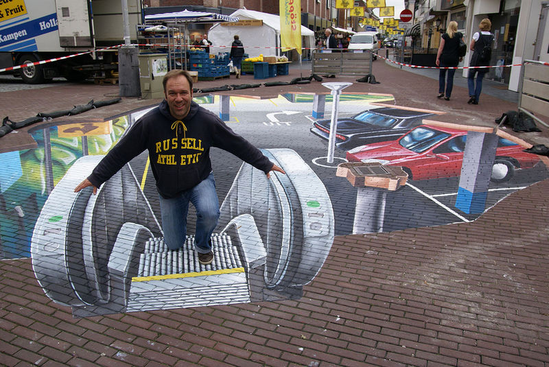
This distortion is used to amazing effect in Leon Keer’s art he produces street images on flat surfaces such as paths or sidewalks.  Drawn in chalk and then coloured, wonderful 3D images when viewed in the right position appear to leap out at you from their flat surroundings.  From standing at another position they appear smudged or distorted and the illusion is gone.  Using the same techniques as the early practitioners in Renaissance Italy, Leon and his contempories create these incredible visual feasts.

Going up! Leon Keer and one of his creations.


My math’s teacher always bemoaned my lack of ability in class I like to think that my understanding the art of perspective and putting it into practice I’m solving mathematical problems every day.

A little help refresh those memories of lessons can be found in this how to guide. http://www.wikihow.com/Draw-Perspective

Or a good reference for kids is How to Draw Comics “Marvel” Way by Stan Lee.  I still have my own aged and well thumbed through copy on my book shelves
.
If you would like to read a little more about this try The Ascent of Man by Jacob Bronowski a great book that covers art and mathematics and the development of the human mind and scientific progress.


Dylan Gibson